yandex market
large-scale marketplace with 18M+ active buyers and 60K+ daily sellers

sellers lost the first hours of every morning digging through dozens of open order tabs across scattered sections
goal
match the seller's real workflow, make order flow transparent, lift satisfaction, and cut storage costs at Market warehouses
solution
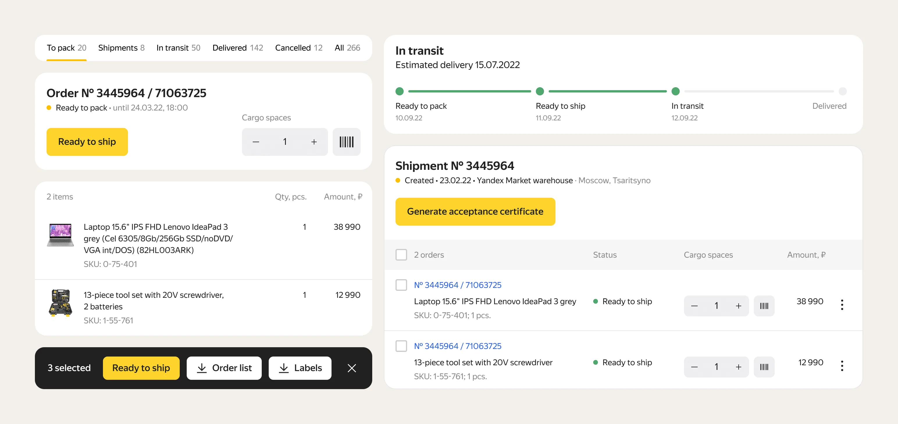
orders grouped by status and work priority, processed in bulk or in a split-screen card, with logistics tracked inline
- DAU
- 60K+
- faster order prep
- +35%
- same workflow for orders
- 10 → 10k
discovery
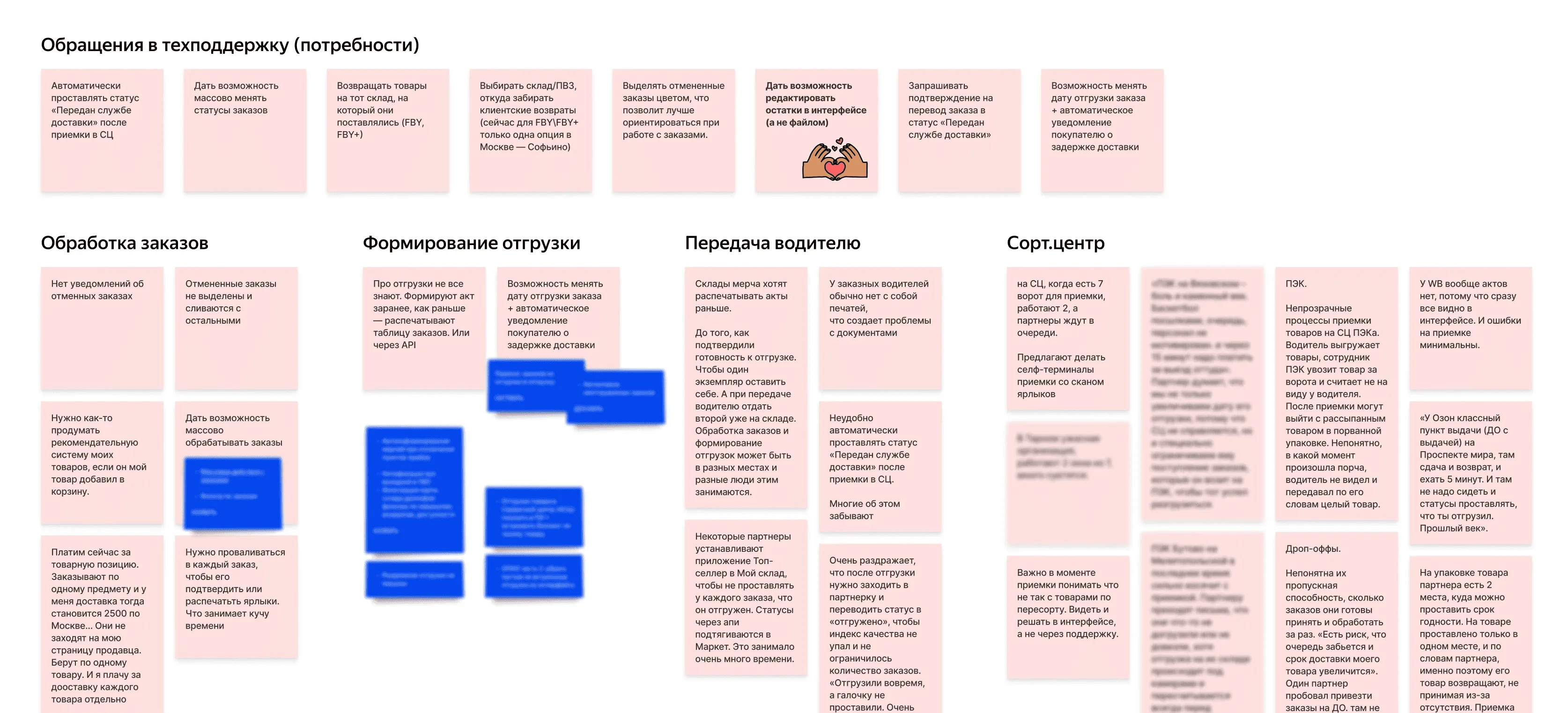
I interviewed sellers, watched them work orders at their warehouses, and mined prior research and support tickets.

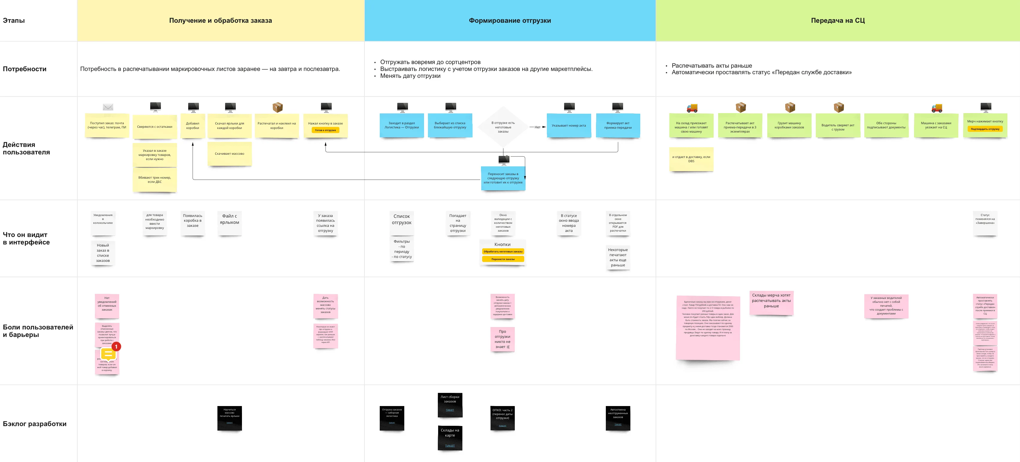
tab by tab, every morning. Sellers spent 2 to 3 hours each morning on 50 to 150 orders, each opened in its own browser tab.
the flow kept breaking. Shipments lived in a separate section most sellers barely understood, and with no bulk action they jumped out mid-task to prep dispatch.
built the CJM from "what did you do today". Asking what they did today pulled out the real workflow instead of a tidy story. I also watched sellers on Ozon and Wildberries for free competitive research.
align to the work
from status board to a day's work. Group orders by lifecycle priority so sellers move by action instead of hunting across system states.
bulk and visible logistics. Process many at once, and always see where each order is and how many sit in each status.
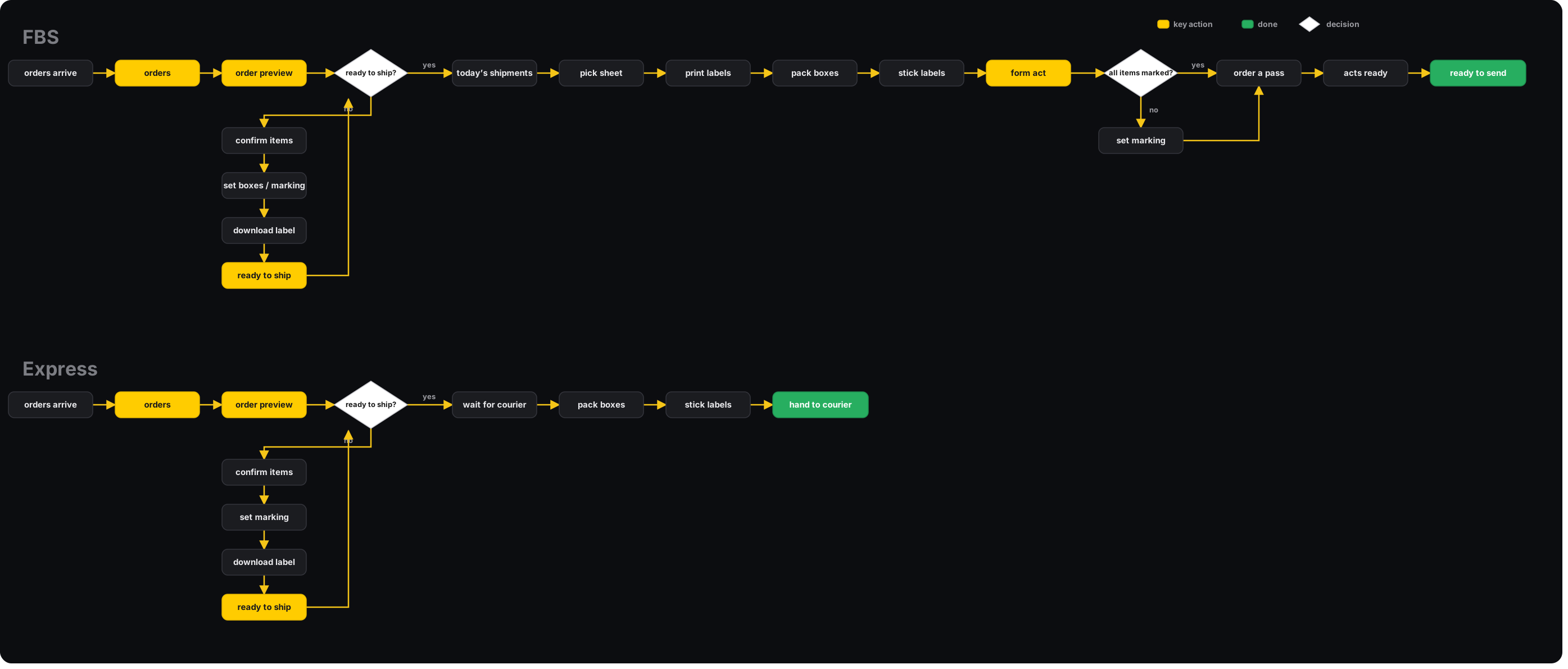
match the real process. The design follows the seller's physical workflow from the CJM instead of the system's internal model.
designing it object-first
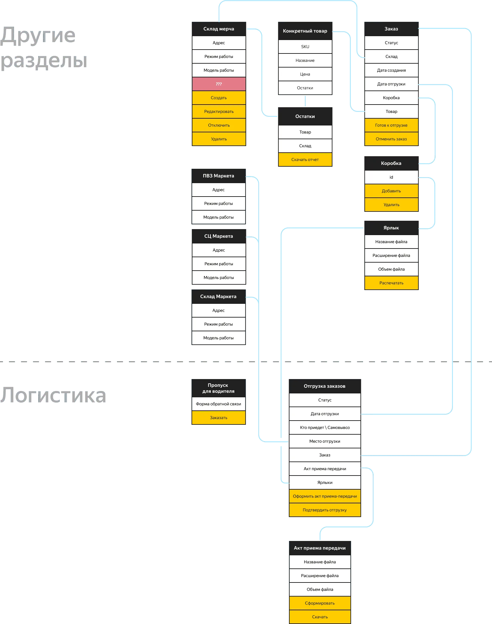
mapped it object-first. Job stories → user flow → an object map of orders, boxes, labels, shipments, and acts → a prototype on the board with the team.

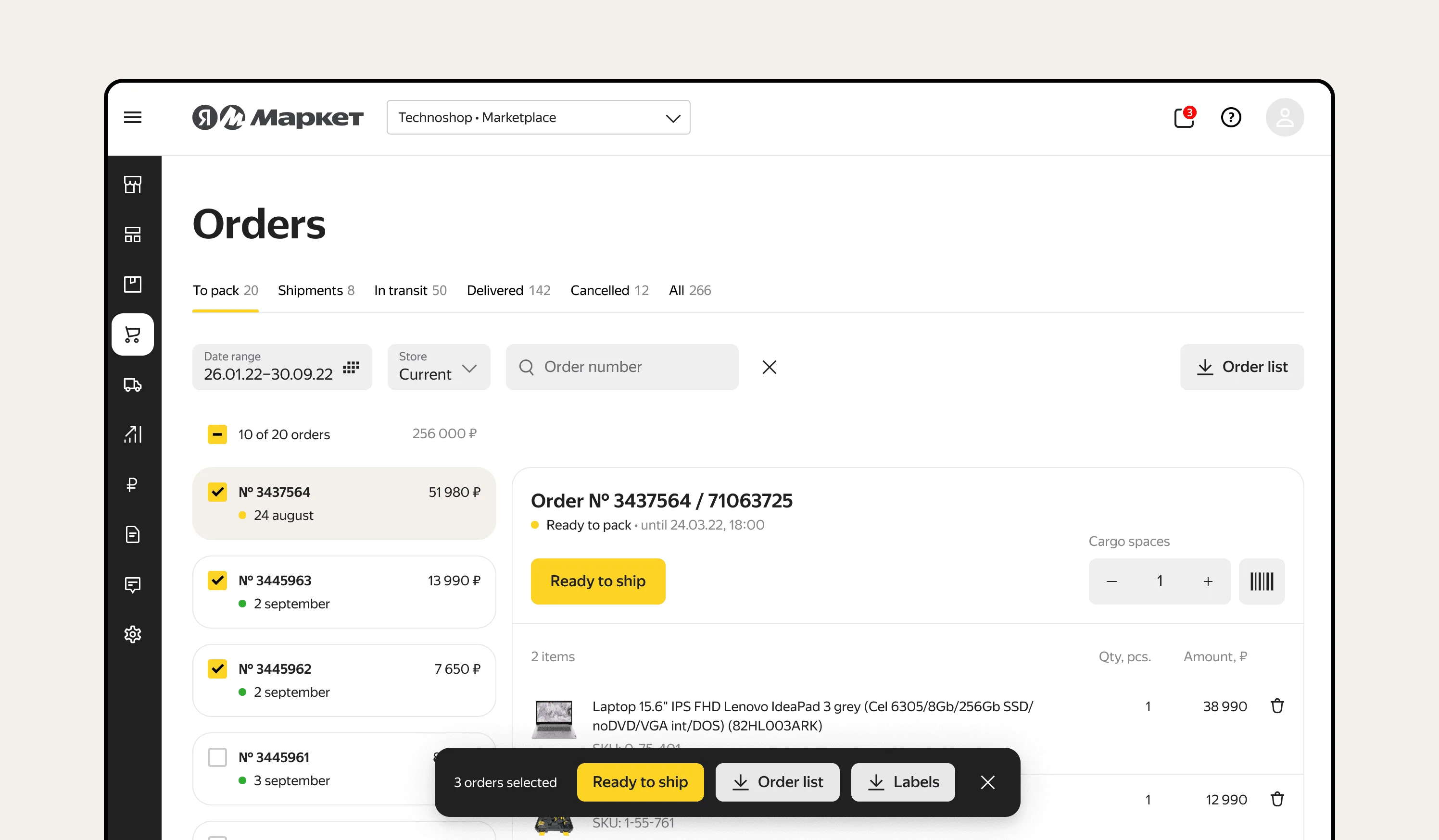
replaced new tabs with a split-screen. I put the order in a card on the right, so you view and process it there. Done orders drop to a table you just track.
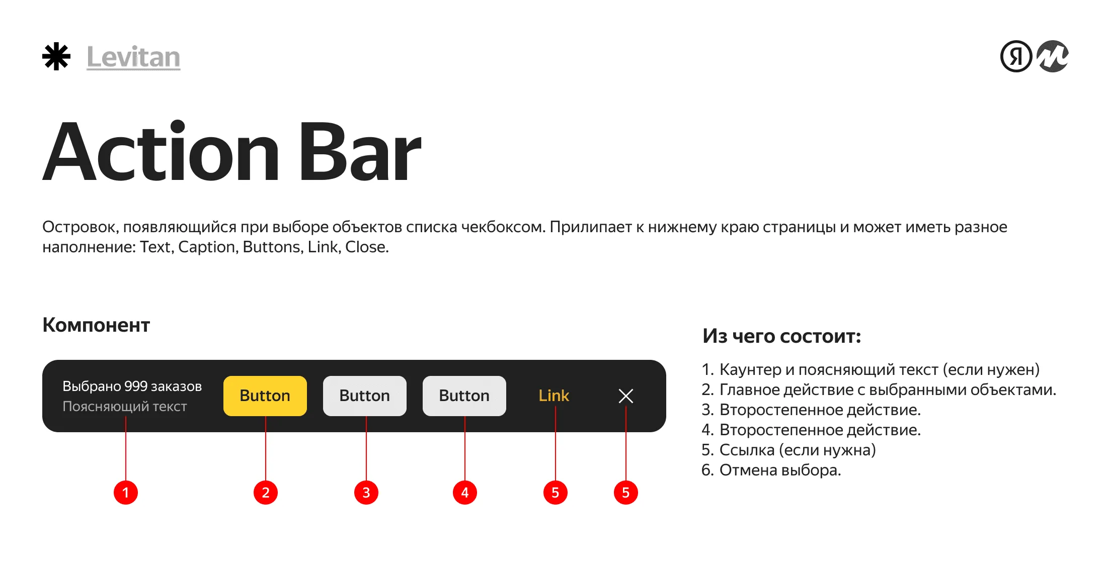
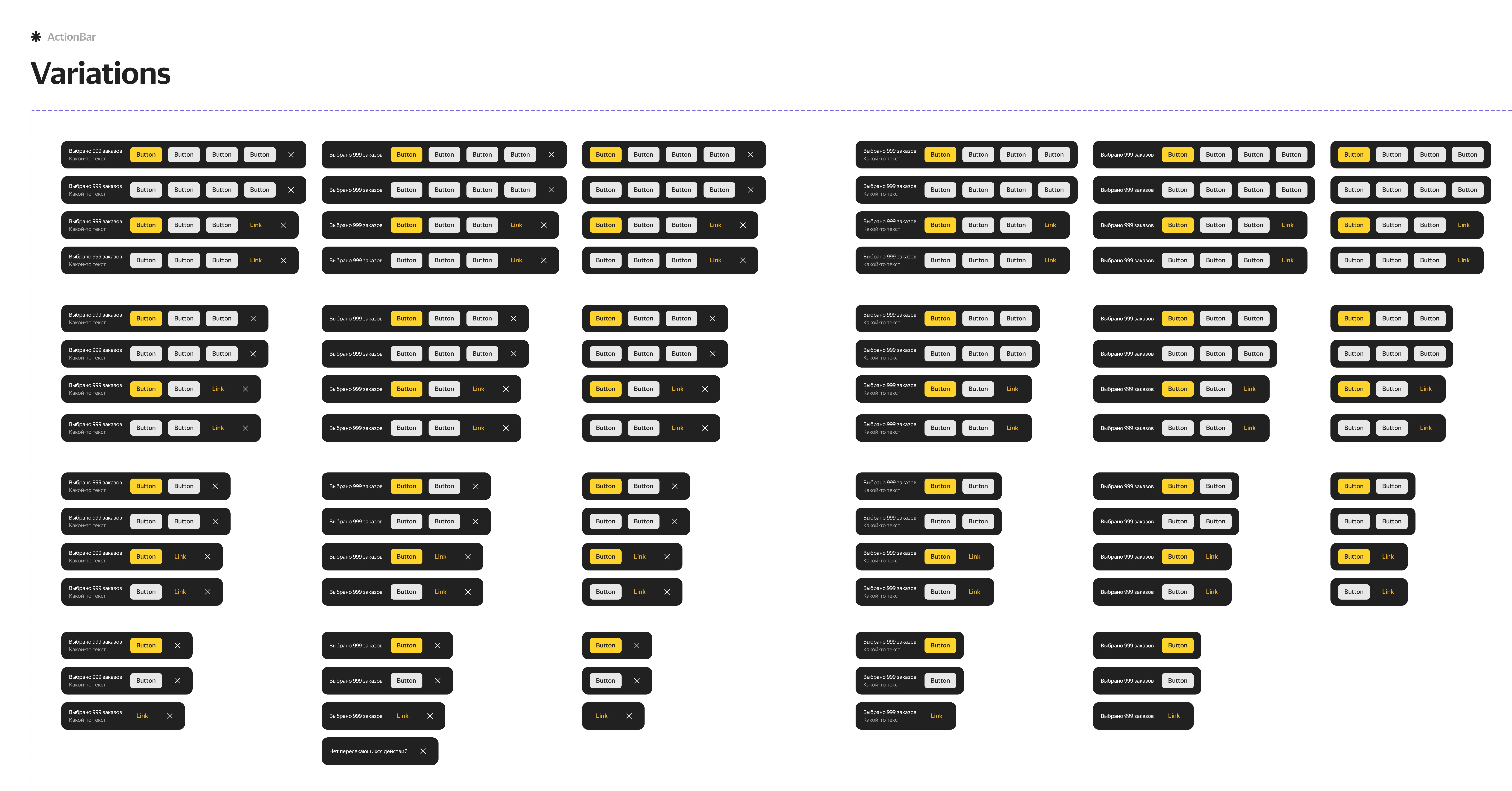
bulk actions on selection. Checking orders brings up an ActionBar pinned to the bottom, so sellers confirm readiness and prep shipment for many at once.
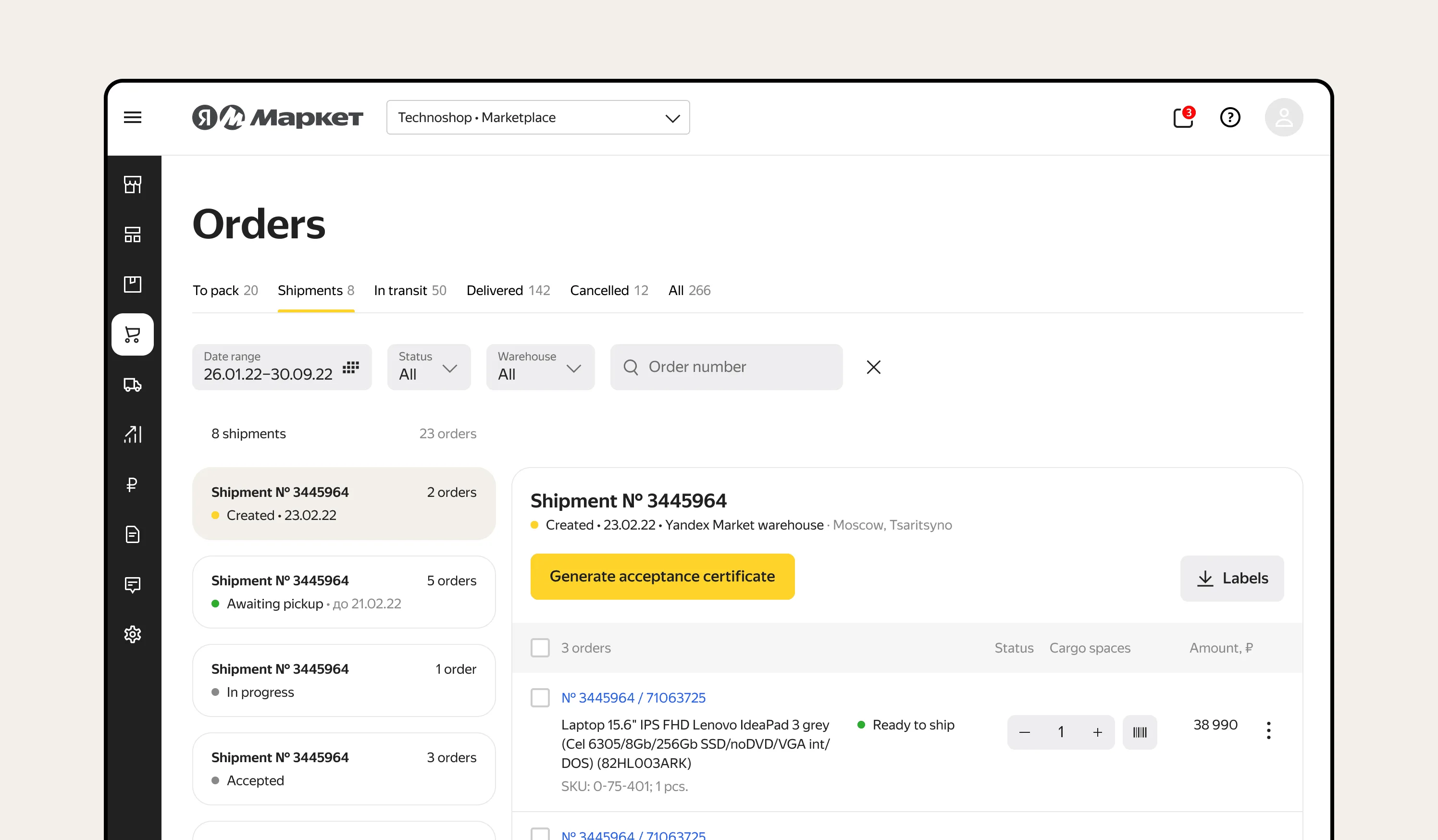
untangled shipments. The part nobody understood. I gave it a clear view: orders grouped for the day's dispatch, the acceptance act generated in one place, and handoff to the sort center confirmed inline.
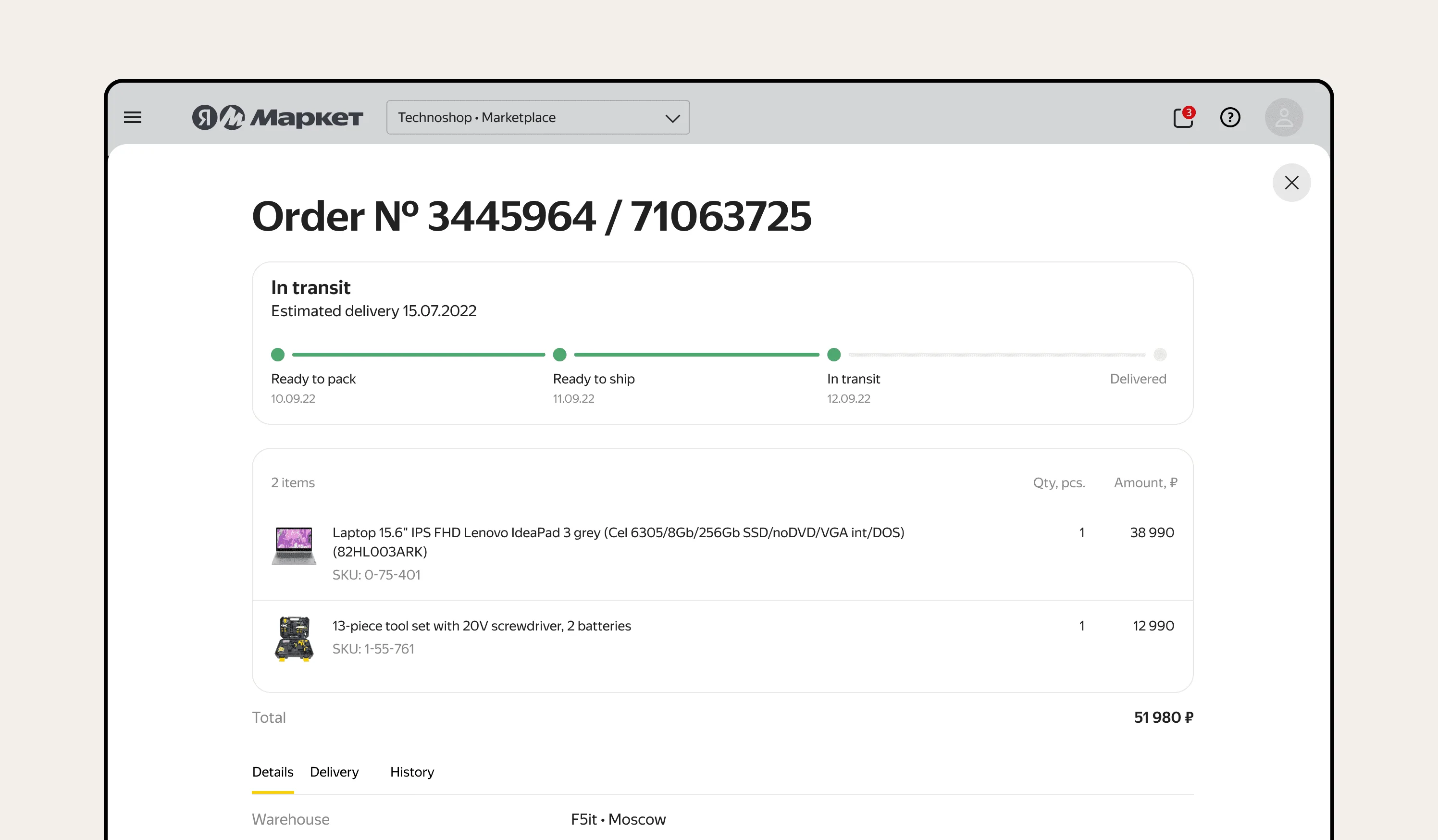
the order without leaving the screen. Instead of a separate page in a new tab, an order opens in a split-screen card or a drawer, so sellers keep their place and the scenario never breaks. Status stays transparent end to end.
validated on a prototype first. I ran moderated tests with real sellers, the new flow against the old, before committing to design.


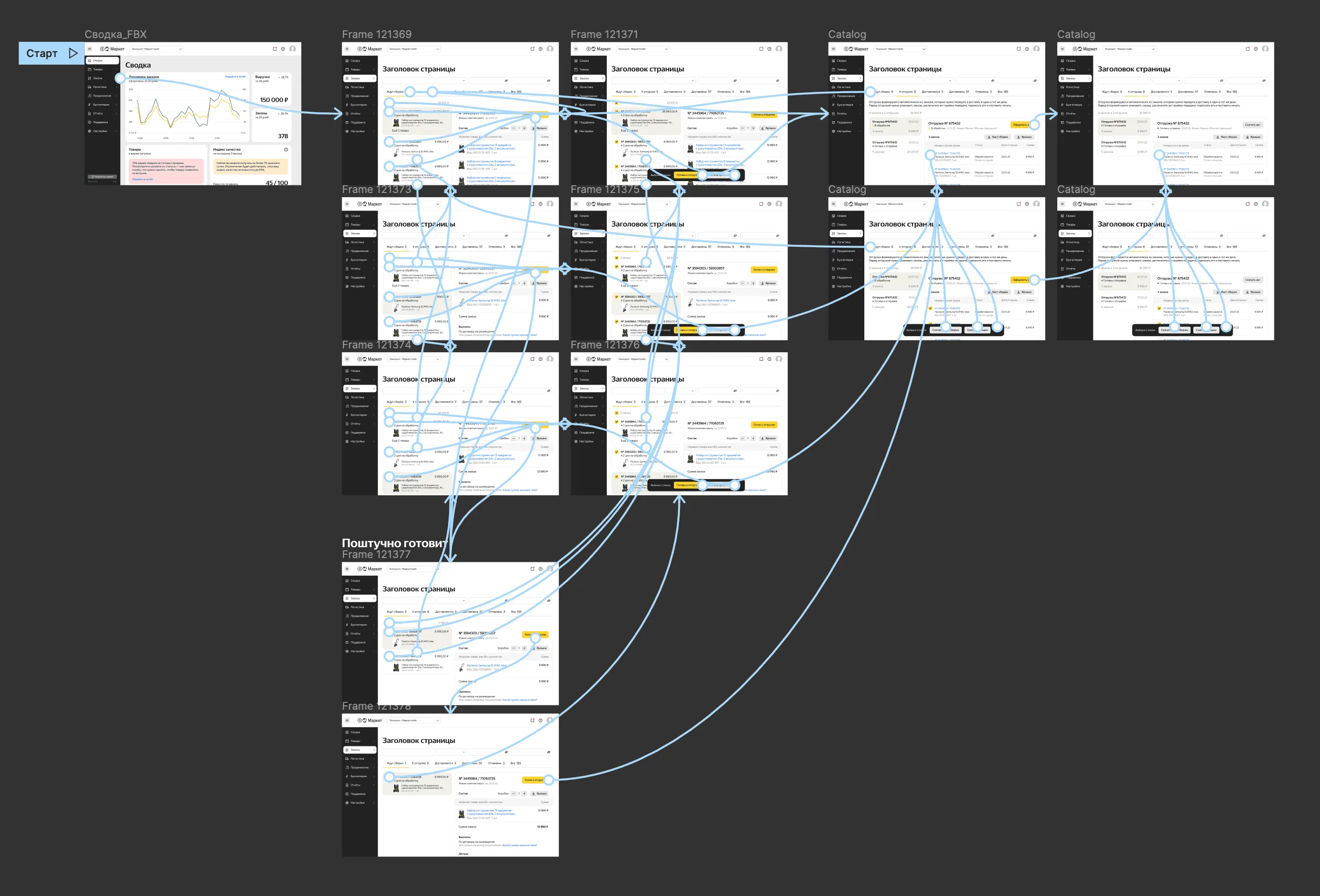
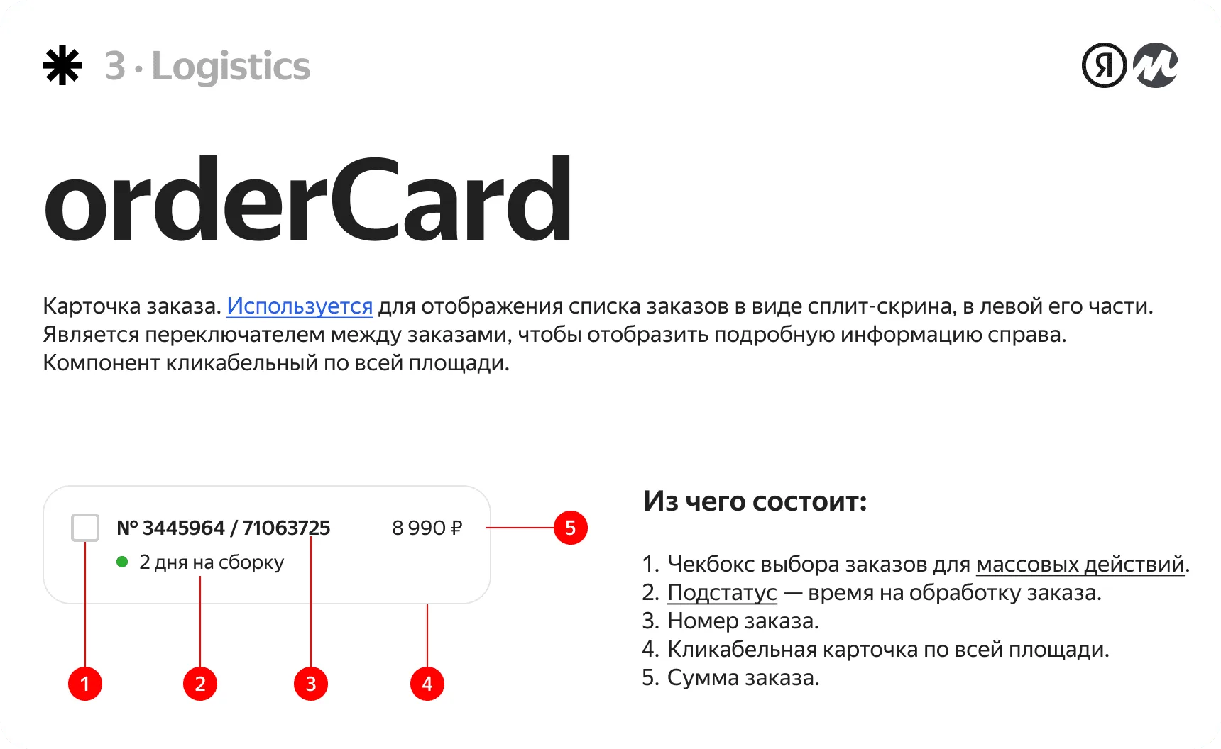
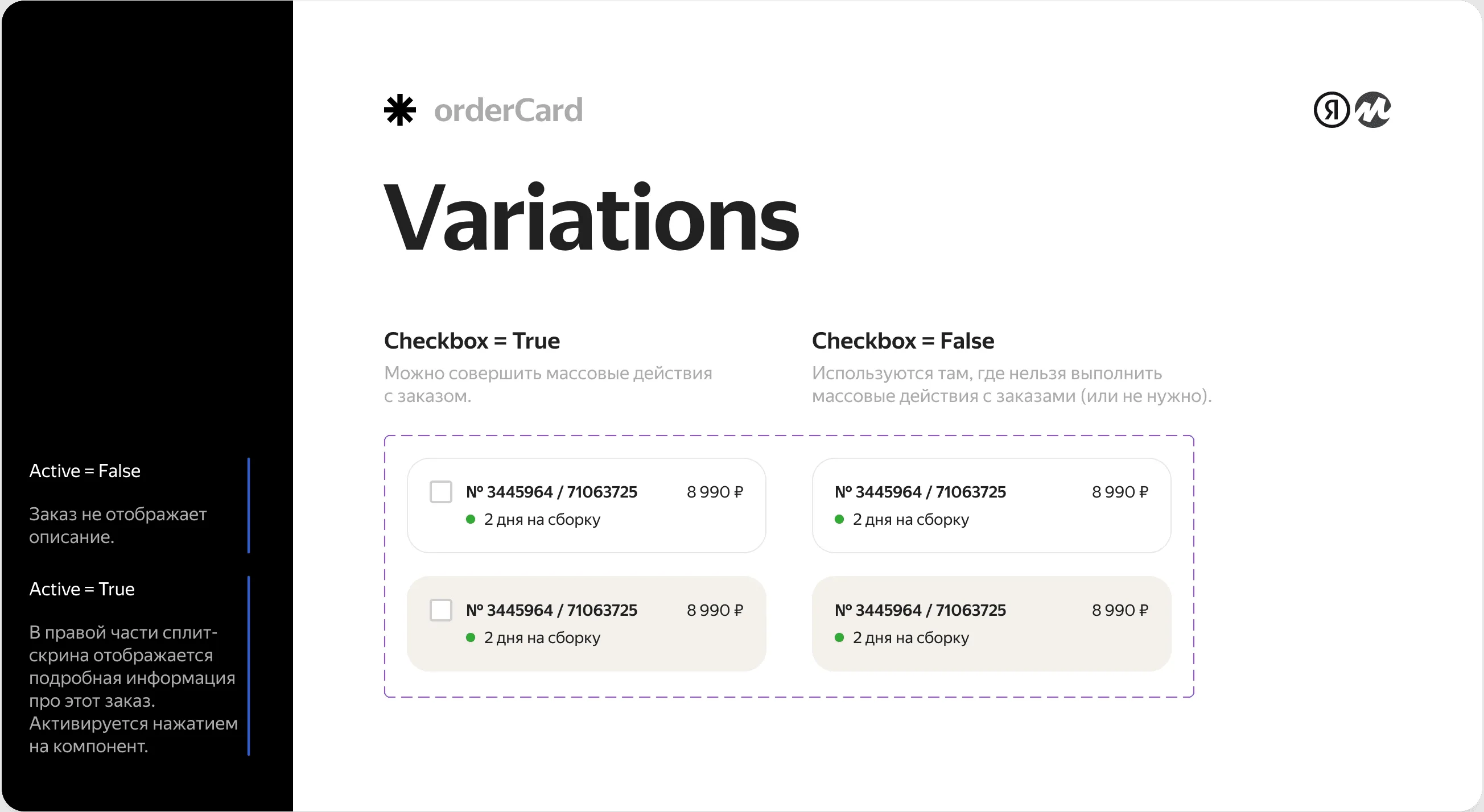
shipped on design system. I built new components into Levitan (the bulk-action ActionBar and the orderCard) and reused the rest, then QA-reviewed layout and logic on staging with devs.
scope & constraints
the box I had to fit. Top-3 section by traffic meant I couldn't disrupt daily work. Shipments auto-generated by delivery date, so I designed around that rule.
split-screen over patching the legacy table. I convinced the team to rebuild with a split-screen instead of patching the legacy table; backend wanted the legacy gone, frontend wanted it done right. It cut processing time and clicks, ended the dozens of tabs sellers juggled early on, and gave one seamless orders dashboard.
the table stays, the order opens in a drawer. Orders that need no processing (in transit, delivered, the full list) stay a table. Opening one slides out a drawer instead of a new page, with status end to end, so sellers never leave the section or spawn tabs.
result
for the seller. Process in 3 clicks or in bulk, in one section, with logistics inline. The morning tab-juggling is gone.
the business won too. Faster, more reliable processing meant fewer delays and lower storage pressure at Market warehouses.
- DAU
- 60K+
- faster order prep
- +35%
- same workflow for orders
- 10 → 10k
scale & system
scales with volume. The status model works the same for a seller with 10 orders or thousands a day.
reusable across the dashboard. The ActionBar and orderCard I built went into Levitan, so other teams reuse them instead of rebuilding.
reflection
I chose a clean rebuild over safe iteration. The old section was organized around the system's statuses; sellers think in the order of their day. I rebuilt it around their workflow instead of the database's state model.
In high-volume B2B, the interface should mirror the user's real process rather than the system's internal structure. Align to the work, and the screens almost design themselves.